Weekly Planner Comparison: Muji vs. Leuchtturm1917
Monday, November 30, 2020One of my favourite things about approaching the new year is starting in a fresh new planner. I've definitely dabbled into the world of Bullet Journal-ing, but still haven't found a method that works for me on a day-to-day basis. I still use it to set up monthly spreads, but don't usually pick it up again the rest of the month; I think I enjoy the practice of planning out my month more than anything.
Last year I picked up one of Muji's weekly planners and absolutely fell in love with the layout. Having the week laid out daily and then also broken into hours is the blessing I never knew I needed lol. Imagine my devastation when I couldn't find this exact planner this year. First I thought there was either a production shortage or delay due to the pandemic but after waiting months without luck of locating this planner I knew it wasn't going to be.
I know that there are tons of options out there (including the Bullet Journal I already own) that carry the same layout, but I still prefer this Muji one because of the dimensions (~5x7inches) and the minimal font and design.
For 2021 I decided to pick up this Leuchtturm1917 Week Planner because of the gorgeous Pacific Green colour (and yes...I've already sticker-bombed it).
The Leuchtturm1917 is a standard A5 size which I don't mind and the Muji planner is the same width but the length is a bit shorter which I prefer.
Comparison
2. Pockets: The Muji planner comes with a plastic sleeve with pockets at the front and the back. It's not as deep as the "pocket" that comes on the back of all Leuchtturm1917 books but I don't really keep much in them anyways.
3. Year at a glance: I actually didn't use these pages at all this year but can see it useful for highlighting birthdays and other important dates. The Muji planner again is super minimal and clean; the year overview is spread across two pages so the columns are more narrow compared to the Leuchtturm. The Leuchtturm spreads the year out into 4 pages so definitely more space to write. Another nice thing about the Leuchtturm is that it also includes the next year as well.
4. Month at a glance: The Muji planner includes a monthly calendar layout for the year which is nice. Leuchtturm one doesn't but I don't think it's something I will miss (seeing as I didn't use this either this year).
5. Project Planner: I actually am excited about this project planner spread included in the Leuchtturm as I will be using this planner exclusively for work. It definitely be interesting to look back at all the projects worked on over the year and keep track of the length, deadlines, etc. The Muji planner does not include this.
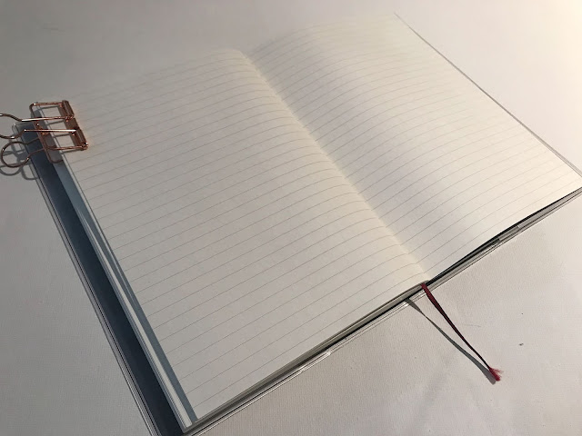
6. Note pages: The Muji planner comes with extra ruled pages and the Leuchtturm includes plain pages; both good for random notes, doodles, etc., While I do prefer plain pages in general, I think I ruled or dotted would be more purposeful for a work planner (definitely personal preference though).
Do you have a preferred planner layout? Brand? Let me know what else I should look into with a similar layout.
Thanks for reading!
D


